Hero Cards
Hero Card steps are commonly used to display content like product details, menu options, or any structured data, allowing users to interact by selecting from various options.
In this guide, you’ll learn how to configure a Hero Card step and implement advanced scenarios to tailor the conversation experience to your needs. By following the steps outlined below, you can ensure your AI Agent effectively captures and responds to user selections, creating a more dynamic and interactive dialogue.
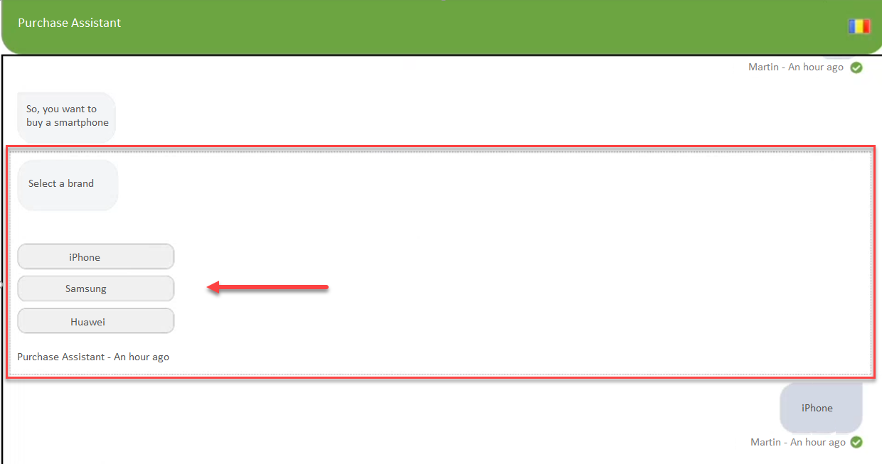
| Hero card
|
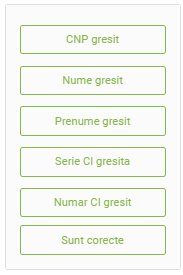
Menu options using a hero card
|
|---|

Adding and configuring Hero Card steps
To add and configure a Hero Card step in a DRUID flow:
- Open the desired flow in Flow Diagram view.
- Expand the Flow Palette, then drag the Hero step from the Dialog category into the main flow window and drop it onto the step you want to link it to.
- Select the step on the diagram, then click the Settings icon from the Actions menu.
- Set the General parameters:
- Step name: Give the step a descriptive name that helps you remember its purpose, like "Hero cards".
- Step message: Enter the message that the AI Agent will display to the user, such as "Choose from the options below".
- In the Input Mapping field, specify where you want to store the user’s selection, such as a variable or an entity field. For example, you can use a variable like @option to capture the user's choice.
- Go to the Metadata section.
- If you want to prevent users from clicking the card multiple times, enable Inactivate card after usage. This option works only on DirectLine (Web channel).
- Click the Edit button to configure the Hero Cards.
- Add more cards by clicking the Add card button.
- You can include elements like an image (by entering the image public link), title, subtitle, and description for each card. In the Navigation URL field, enter the URL which will open a new page in the browser when the users will click on the image in the card.
- To create a menu with multiple options, add interactive buttons to each card by clicking Add button. Define the button's tag, visible text, and any custom CSS class for button styling if you are using custom styles. Repeat this step for as many buttons as needed.
- Click the Save button to save the flow step configuration.
You can preview the hero card by clicking the Preview button.
If you want to put information into a specific context, you can do so, by setting variables on the step. For more information, see Set Variable.
You can also set specific actions to be executed before or after the step execution. For more information see Pre Actions or Post Actions.
The figure below shows how a hero step configuration might look like.
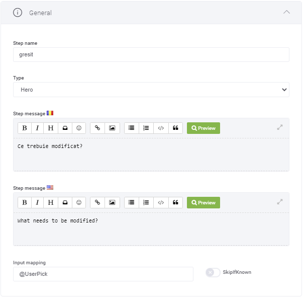
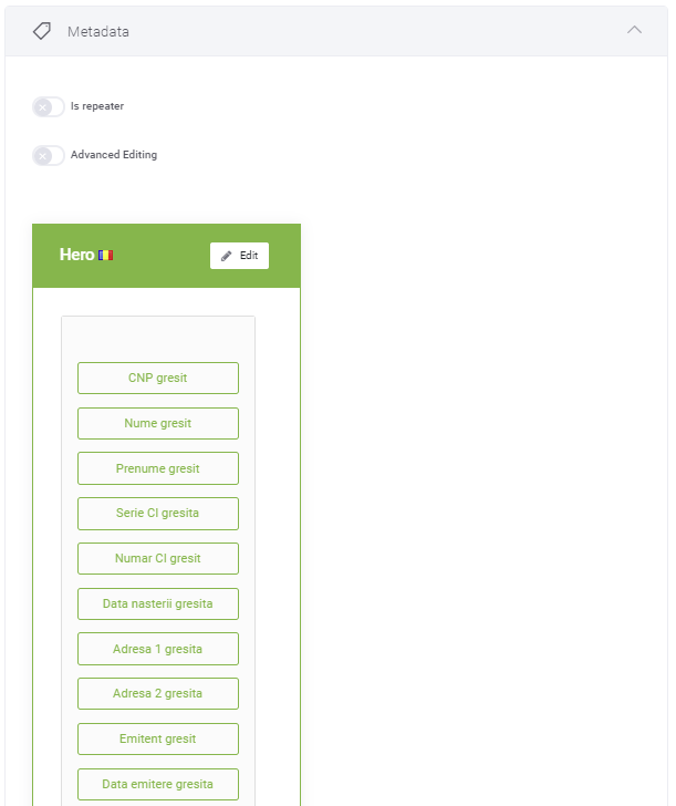
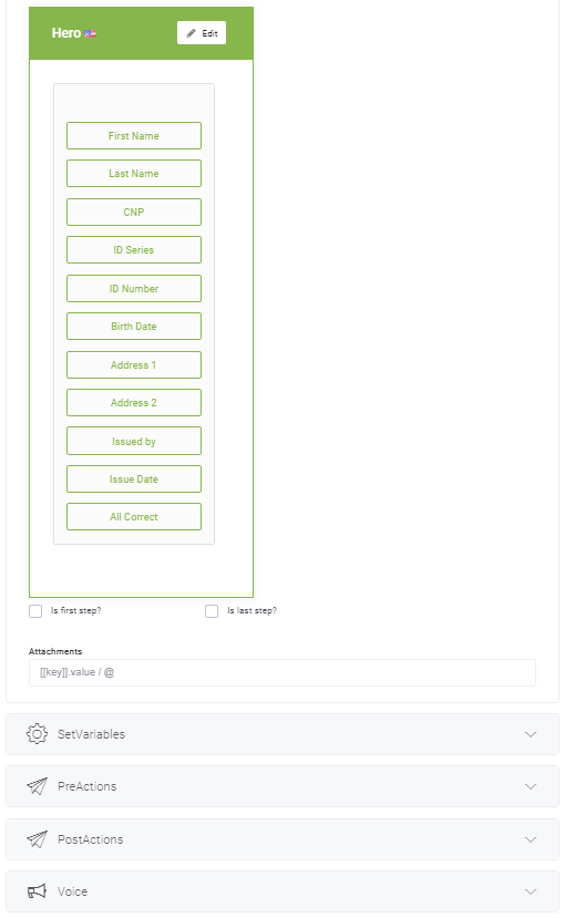
This Hero step provides the users with the possibility to select from a menu which of their data has not been properly processed by the AI Agent in a previous step or select if all data has been properly selected.
Configuring a hero card with multiple buttons for collection items
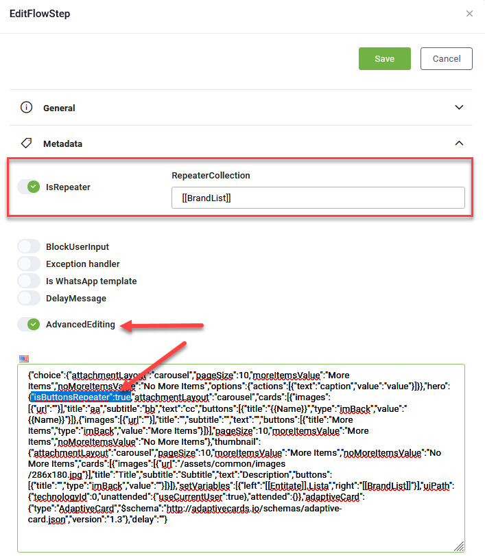
By default, a hero card step with Is repeater generates for each item in the provided collection. You have an advanced option to generate a hero card with as many buttons as items are in a collection.
Example:
To configure a hero card with multiple buttons:
- In the Metadata section, tap on Is repeater and in the Repeater collection field, specify the name of the entity list (e.g., [[EntityList]], [[<Entity>]].<EntityListField).
- Tap on Advanced editing and add the following parameter under the hero step:
"isButtonsRepeater":true,. Create Multiple Buttons. Tap on Advanced editing, and in the JSON field, under "hero" add "isButtonsRepeater": true to create one card with multiple buttons.
Configuring hero card buttons to open URLs
To configure hero card buttons to open specific URLs, navigate to the Metadata section and select Advanced editing. Locate the "buttons" object, and for the desired buttons, adjust the following parameters:
- Set the button type to "openUrl".
- Set the button value to the desired website URL.
Example
"buttons": [
    {
        "title": "Buy",
        "type": "openURL",
        "value": "https://buythisproduct.com"
    }
]
When a user clicks the button, the URL will open in a new browser window.
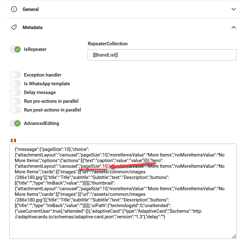
Configuring hero card pagination
By default, a Hero Card displays up to 10 items. If your collection exceeds this, DRUID will create additional cards, showing maxim 10 items per card. You can customize the number of items per page by adjusting the "pageSize" property under “hero” in the step’s JSON settings (Metadata > Advanced editing).
Capturing user selections with Is repeater
If you want to capture the entity associated to the item selected by the user after the hero step with Is repeater:
- On the Hero Card step, configure the Input Mapping with the appropriate variable or entity.
- In the Hero Card configuration, in the button configuration, use the same field from the base entity in both the button "name" and "label".
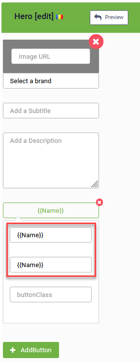
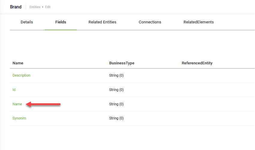
In example above:
- The [[Brand]] entity is the base entity for collection [[BrandList]].
- [[Brand]].Name is a field of type "string" that will store the user's selection from the Hero Card step with Is repeater.
By following these steps, you can effectively use Hero Steps to create engaging and interactive experiences for your AI Agent users, offering them clear, actionable choices and a visually appealing interface.
 Related Topics